What do we imagine when we are talking about pharmacy? As a rule, the image of a snake and a bowl or a sign of a pharmacy cross immediately appears. And always green. These are all cliches with which people often associate a pharmacy. It is really difficult to stand out among the mass of visually similar points of sale of medicines. It is necessary to create a unique corporate identity and use a non-standard image and original approach.

ABOUT THE PROJECT
NUTRIX is a brand that already existed on the market, but the current identity did not contribute to increasing awareness and needed to be updated.
OUR TASK
The previous logo was overloaded with details and there was no corporate identity at all. It made identification even more uneasy. So our task was to fix it completely. We started creating a visual rebranding and image of a modern pharmacy with the help of corporate identity..


APPROACH
The pharmacy industry is developing rapidly and is quite oversaturated. It already generates more competition in the market. In addition, a set of standard cliches with which people strongly associate pharmacies further complicates the task of gaining the favor of users and outshining competitors in this segment.But, we have analyzed the pharmacies' market leaders and understood to attract the attention of consumers we need a unique identity bright style, but not long-used names, colors, and shapes. If the consumer also will receive emotions and the feeling that he is cared for and given a little more than enough, he will choose this pharmacy.

RESULT
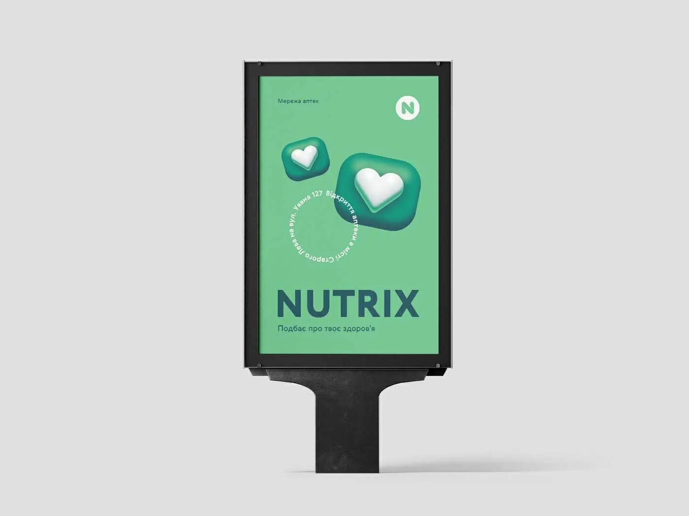
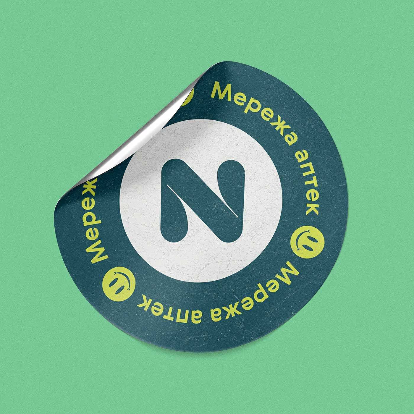
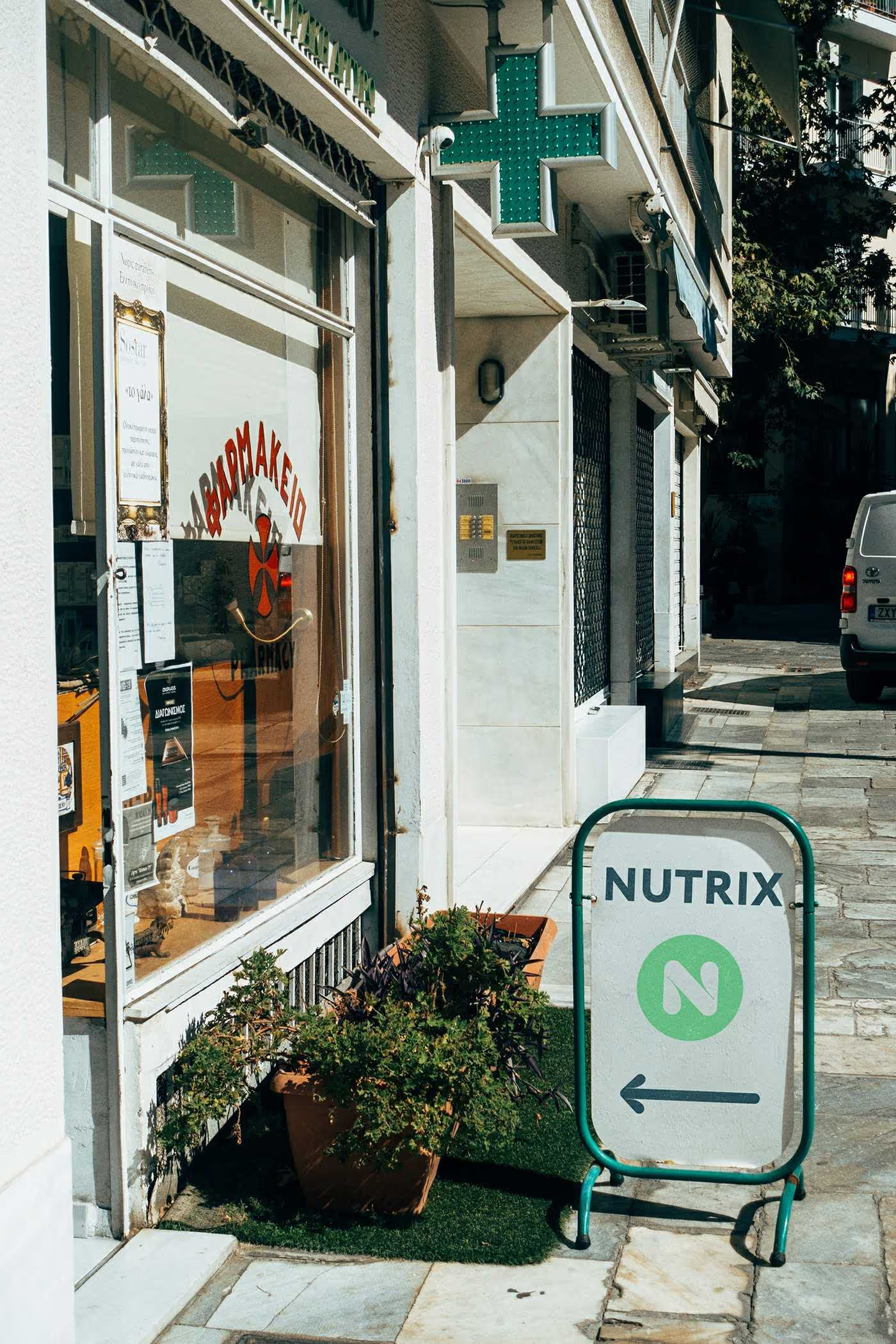
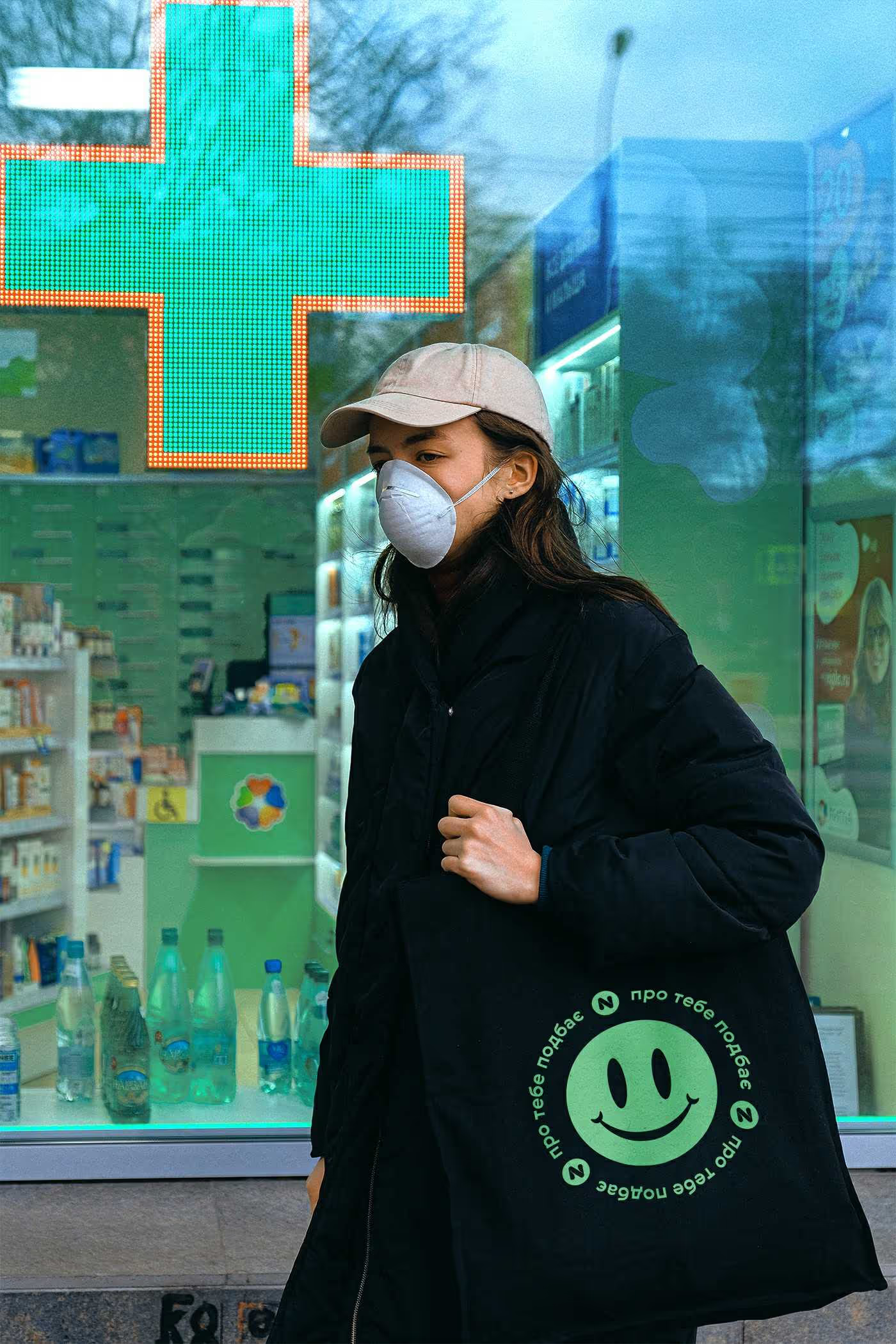
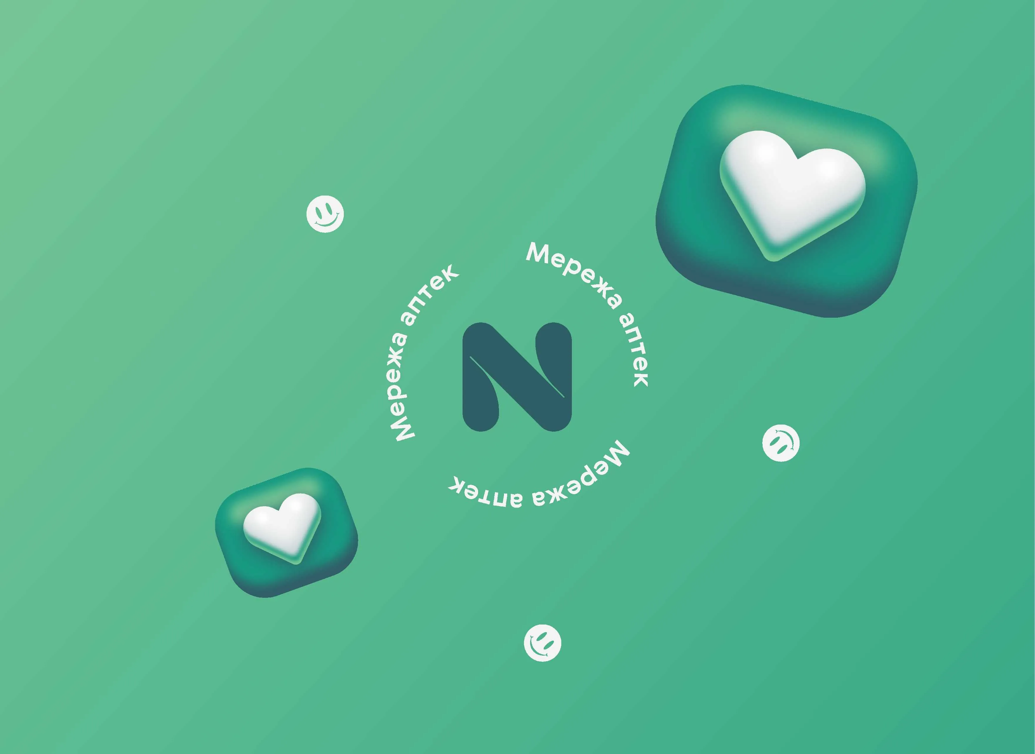
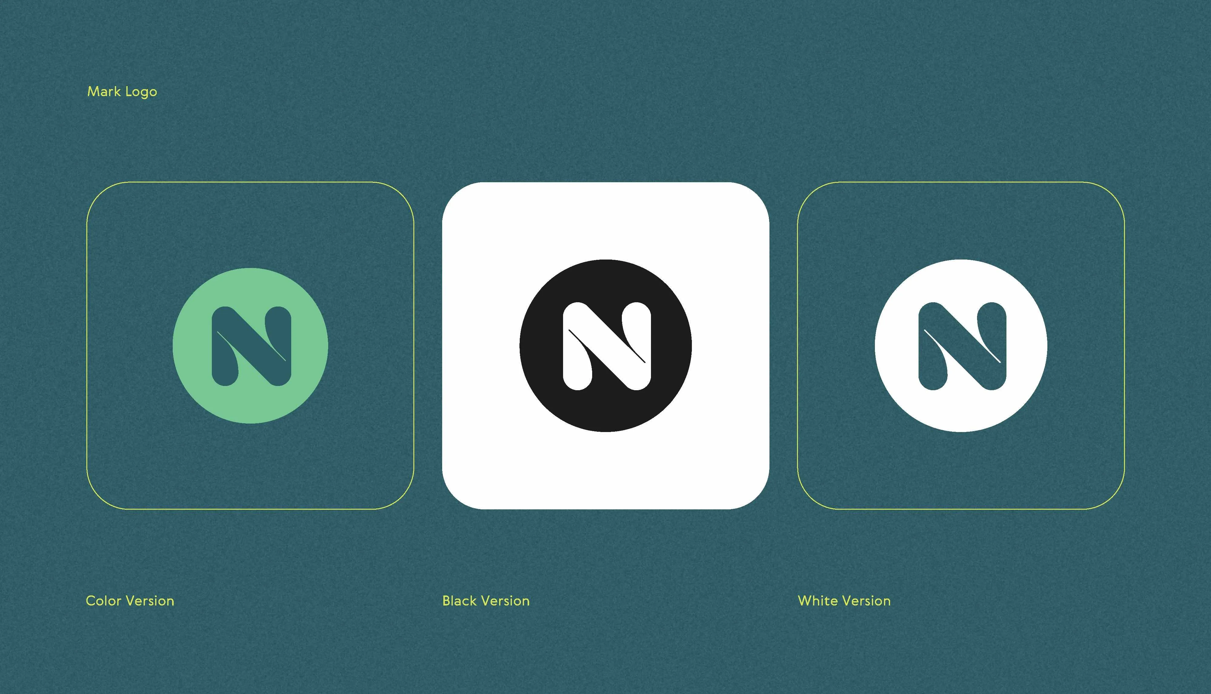
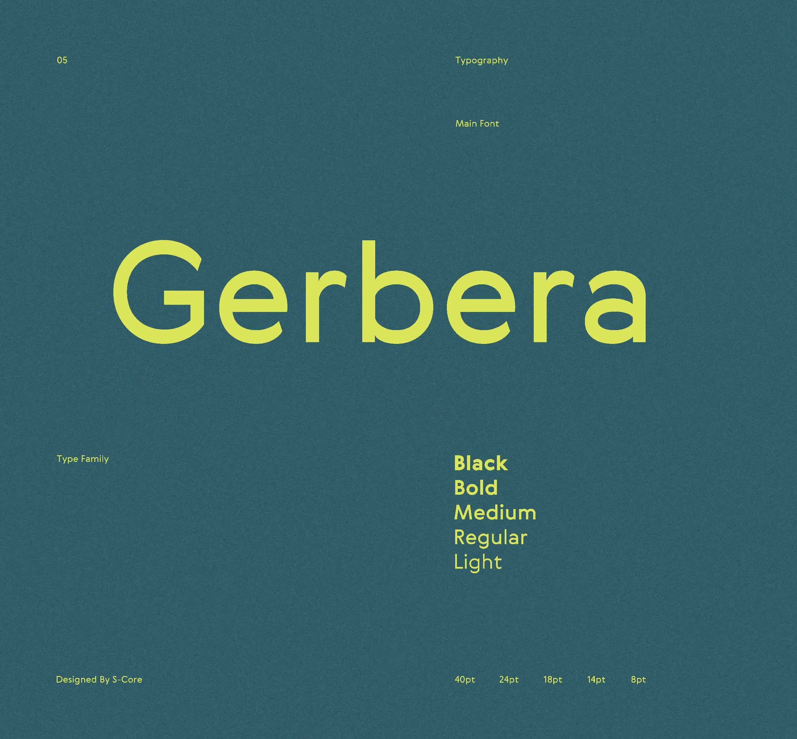
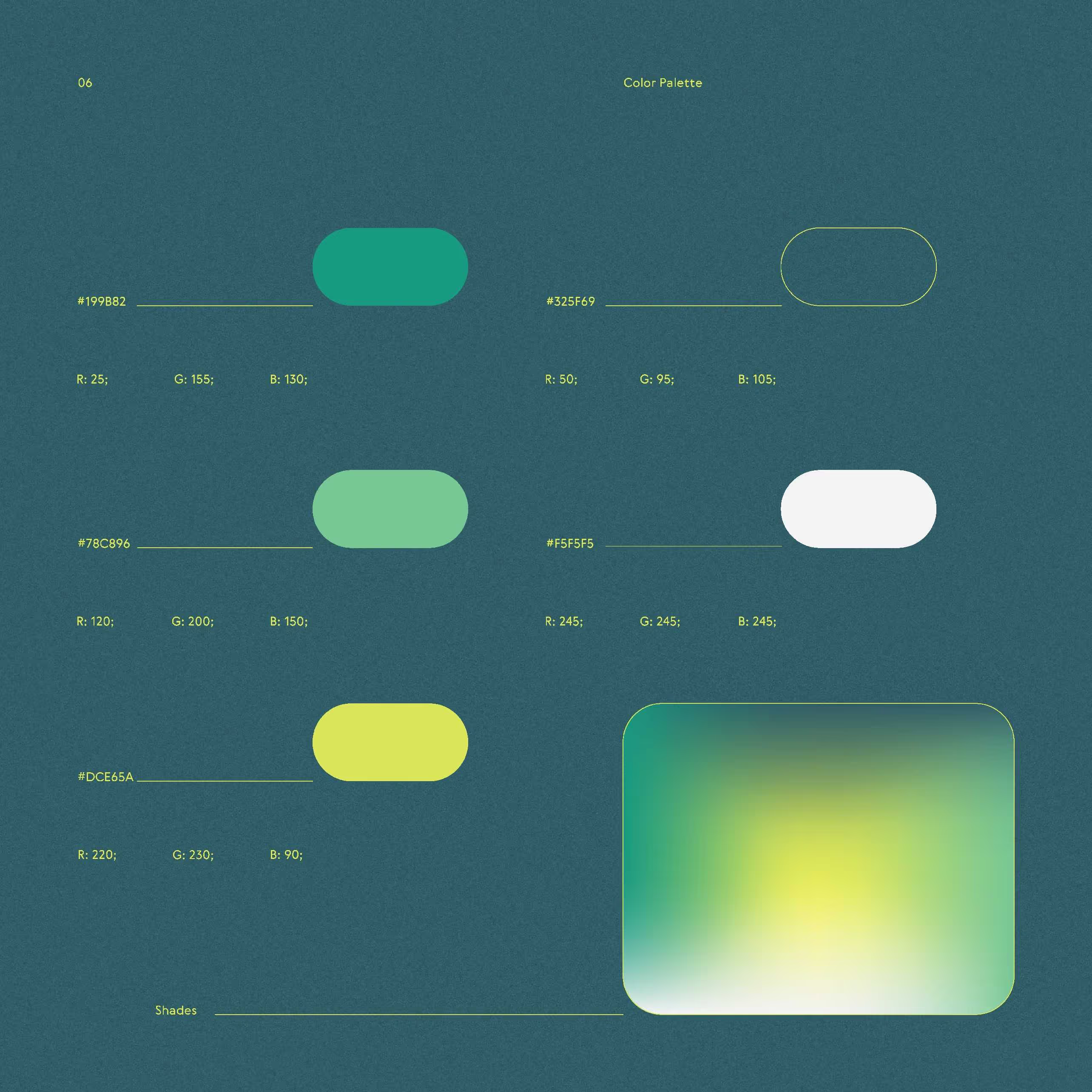
Having taken into account certain mistakes and key points when creating the new design, we created a stylish, bright brand NUTRIX. The corporate green color, the letter N in the logo, and the font created the image of a brand assistant who knows what people need, cares about them, and strives to create the most comfortable communication. Rounding of sharp corners and soft lines of the font complement this image.
The created brand began to stand out sharply among the total mass of pharmacy chains by its name, color combination, and font outline. This was the task set by the client.
To achieve the final goal, we have developed:
-Logo and corporate identity redesign;
-Guidelines for the competent use of the materials created by us;
-File management for further design of social networks to maintain a coherent visual style;
-The new visual concept of the brand for Instagram;
-Developed unique covers for current stories on Instagram.


